Tuesday 18 October 2011

Week 14 - The End

I did it! I made it to the end of a very busy, stressful semester. Below is photos of my final submission- I had some last minute printing issues but had to let it go in order to make this mornings 8:30am deadline.
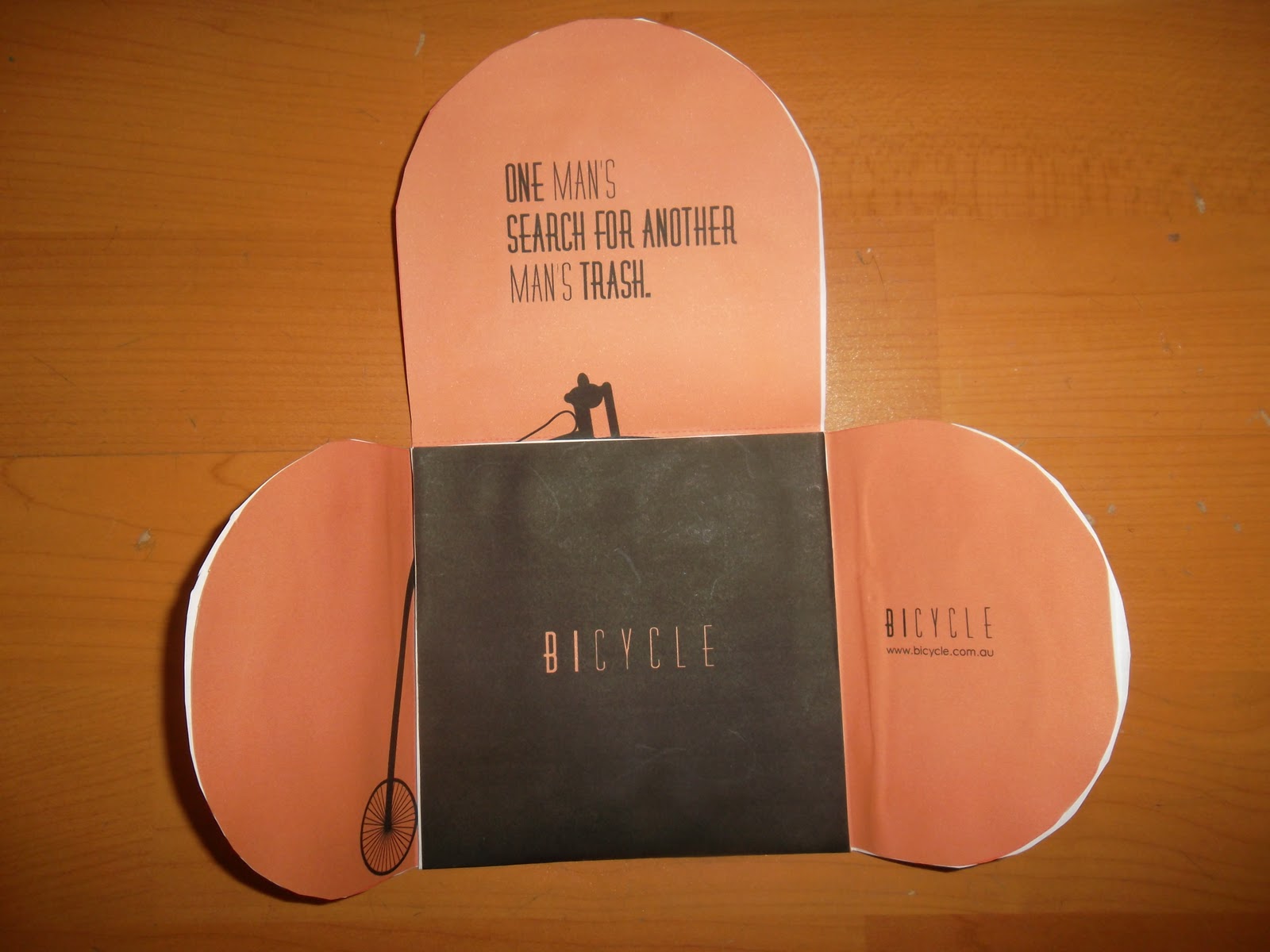
Because I used different printers- The orange colour used throughout my brand was represented differently, this along with stock selection was an issue. Following the printers advice I used a 300gsm board to create my packaging- This is not strong enough to work as a package and because blocks of colour were printed directly onto the board this caused cracking!
All in all, a definite learning experience- leave more time to print, save more money to waste up on prints that 99% of the time end up in the bin and definitely experiment more.


Although the printing process was disappointing, I  am happy with my overall brand and absolutely love my title sequence. I really enjoyed this class even if at times I didn't show it. Making movies was something I never thought I could do and am super happy and even proud that now after 14 short weeks I can!

Saturday 15 October 2011

Tuesday 11 October 2011

Revised Package Design

Okay, so after todays class I, with the help of Jodie have tweaked my package design. I am still using the same template however am now just approaching it differently. I have turned the template sideways creating a purse/ pouch like case. This works a lot better as a whole piece and the holds the poster and disc inside more effectively.
Further Tweaking-
After mocking up, I realised the folds looked a bit empty or incomplete so did the cover.
I have added typography to enhance the packaging as well as repeating the wheel on the folds to create interest - this works both ways regardless of which fold is on top.


Sunday 9 October 2011

Week 13

Time to panic!!! One week to go and everything is due! 
Things to complete
-Package design (refine/set up for print)
-DVD Label             "            "
-Work on Title sequence-
After spending most of my Sunday listening to the same song over and over again I am happy with and completed my audio for my title credit.
Illustrator file has been set up
Time to put it all together!

Package Design

DVD Case- Front of packaging- I know its very rough, but you get the idea-
Things to fix-
-Alignment of the word Bicycle- There are not quite meeting up on the folds.
-Buy buttons/string/ Elastic to fasten poster
-Print at actual size to test that DVD fits correctly
-Watch type of back cover- its looking a little close to the edge of page.


Tuesday 4 October 2011

Week 12

Poster Roughs- Trying to resolve composition issues! Proving to be quite difficult.
Simple is definitely more complex! 
I am trying to balance out the graphic element with the amount of text that must be included within the poster. The last one (bottom right) almost seems resolved. Removing the heavy black box at the bottom of the poster and turning it into a strip gives the composition a lot more room to breathe and resolves the issue of the logos throwing the comp out of balance- Almost there! :)


I made it!
After tedious changes throughout the week, I have created my final poster!! phew what  a relief!

After a very brief pat on the back I quickly moved onto my package design.
Basically I wanted to continue the branding from the poster and apply elements to the DVD Label and case ,creating a nice little unified piece. 
Of course none of this can be achieved without mockups-


Monday 26 September 2011

Week 11

Storyboard- My Title Sequence
I absolutely love Saul Bass and his work and have sought inspiration from his work. 
The simple graphics with the strong coloured backgrounds really make his work pop! Like Bass I will incorporate simple silhouettes in greys pressed up against bright,bold backgrounds. I think this style reflects and ties in with my branding perfectly- Less is definitely more! 
Bicycle Storyboard-

Saturday 24 September 2011

Week 10-Production Week

Further Exploration of poster and packaging designs.
Now with a basic idea of what I wanted my branding to look like (Clean,Simple, Lots of white Space) I began to think how I could carry this theme through to my Title Sequence....


I am wanting to create or recreate the feeling of a bicycle diagram to introduce the credits within the title sequence. Again I will use vector silhouettes  to illustrate this.
Eg.

I have also re-visited some classic title sequences (vector based) to further seek inspiration!
Superbad- http://youtu.be/tOaecS6CRp4
Pineapple Express Interpretation- http://youtu.be/WHTuHo_jhYE

A rough depiction of my idea and the direction I am wanting to head in.

Vector Poster Concepts


Wednesday 21 September 2011

Week 9

Further Developing poster Ideas Images and brainstorming packaging ideas!

I have decided to use vector images throughout my work as after experimenting with photographic images, I noticed that it does not represent/ reflect the time period adequately!
For example-
I began laying out basic layouts using photos to test look and feel
I want to incorporate the illustration of the penny farthing in the poster as it is part of Bicycles branding and the use of vector reflects the time period perfectly!

I further researched vector bike poster, but this time focused on a more modern take.


Monday 12 September 2011

Week 8

Week 8- Class
Present Style Guide.
Work on Poster & Folds.
Some Inspiration-

For my poster I want to continue through the simplicity of both my production company logo and my actual movie logo. A lot of posters from this time period are traditionally illustrative, however I would like to incorporate a photographic element to create atmosphere and really set the scene. 


Monday 5 September 2011

Week 7

Animated Style Guide
Below is a short 2 minute film showcasing my production logo, movie logo and brand....enjoy!


Monday 29 August 2011

Folding

Brief History of Origami-
Origami is the Japanese art of paper folding. 
The Japanese word origami is itself a compound of two smaller Japanese words: "ori", meaning to fold, and "kami", meaning paper. Although Origami is a Japanese word, origami first originated in China. Japanese origami began in the 6th Century when Buddhist monks introduced it to Japan.


Today origami is used a lot more than you would think. Design wise origami offers many package solutions currently in the marketplace. Origami provides strength, protects the product and often requires little or no glue.


Bicycle


Final Movie Logo- In Black and Full Colour. This logo is also available reversed out in white with a black background. The penny farthing was used to represent not only the physically bike in the story but also used to reflect the vintage take and gives viewers a rough idea of what the documentary is about!

Please note that I have included my chosen colour palette in the bottom right corner. Soft pastel earthy tones were selected again to represent the vintage style and theme used throughout the movie and branding.